
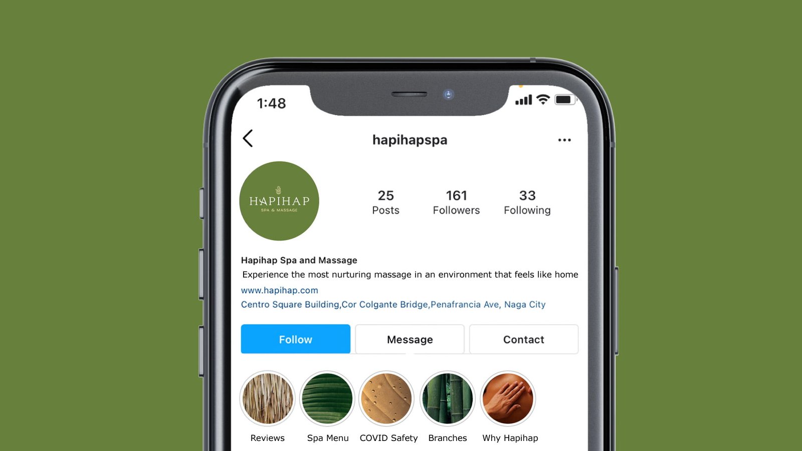
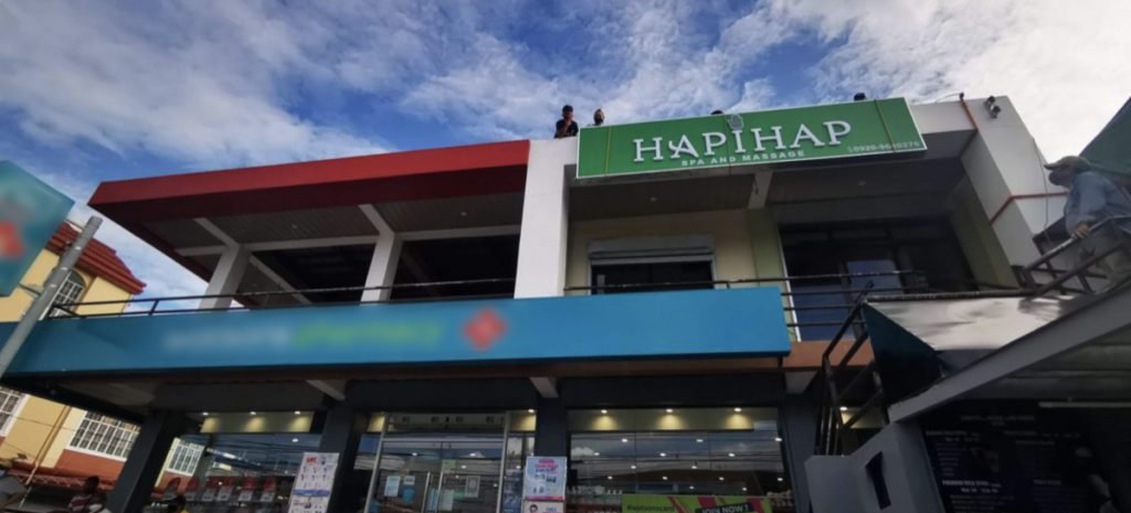
Hapihap Spa and Massage, established in 2013, is located in the province of Bicol, Philippines. They wanted to rebrand in order to modernize the look of the logo and prepare the brand for franchising and expansions.
Marley Designs helped them with:
Brand Strategy + Brand Identity

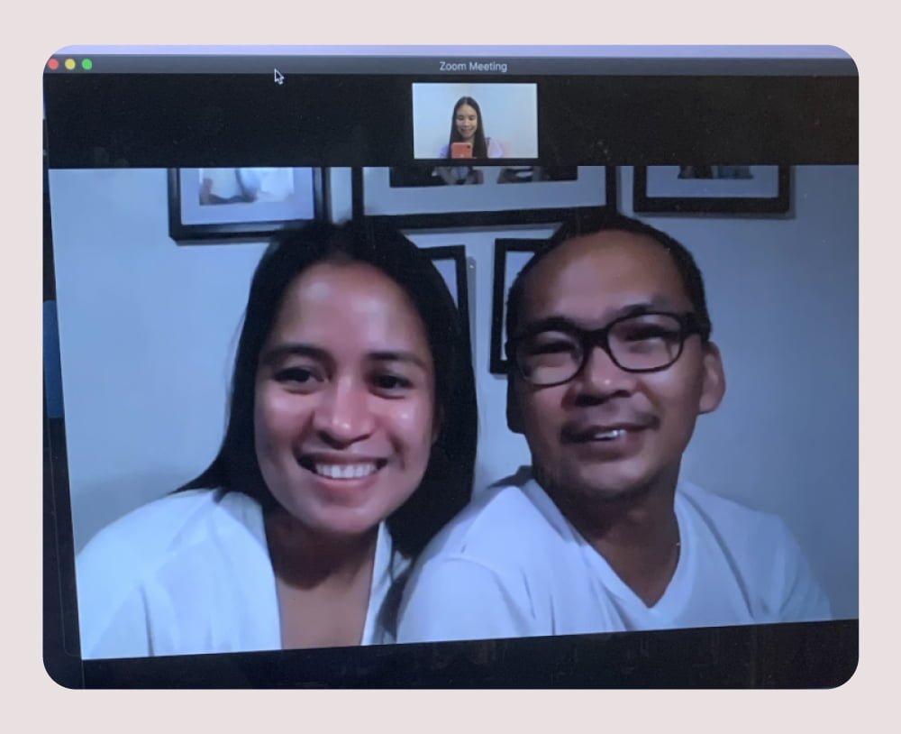
When the owners of Hapihap first reached out to me in July 2021, all they wanted was a new logo. They felt that their logo was outdated and does not represent who they were as a brand. And after further discussion through a Zoom meeting, they agreed that what they needed was a rebrand and not just a new logo.
We hopped on a 3-hour strategy session where we discussed their business, their offerings, their goals, their target market, competitors, and the vision they have for their new brand.
At the end of the session, we were able to come up with a clear positioning that I later improved on after further research. Given the data I got from our session, I was also able to help them weave a story that will further humanize their brand so they could appeal better to their target market.
“For tired professionals who want immediate relief from body pain, Hapihap is a wellness spa that seeks to help recharge and heal the body and mind from stress through caring and holistic massage. Unlike other massage providers, Hapihap is proudly Bicolano and looks and feels like home.”
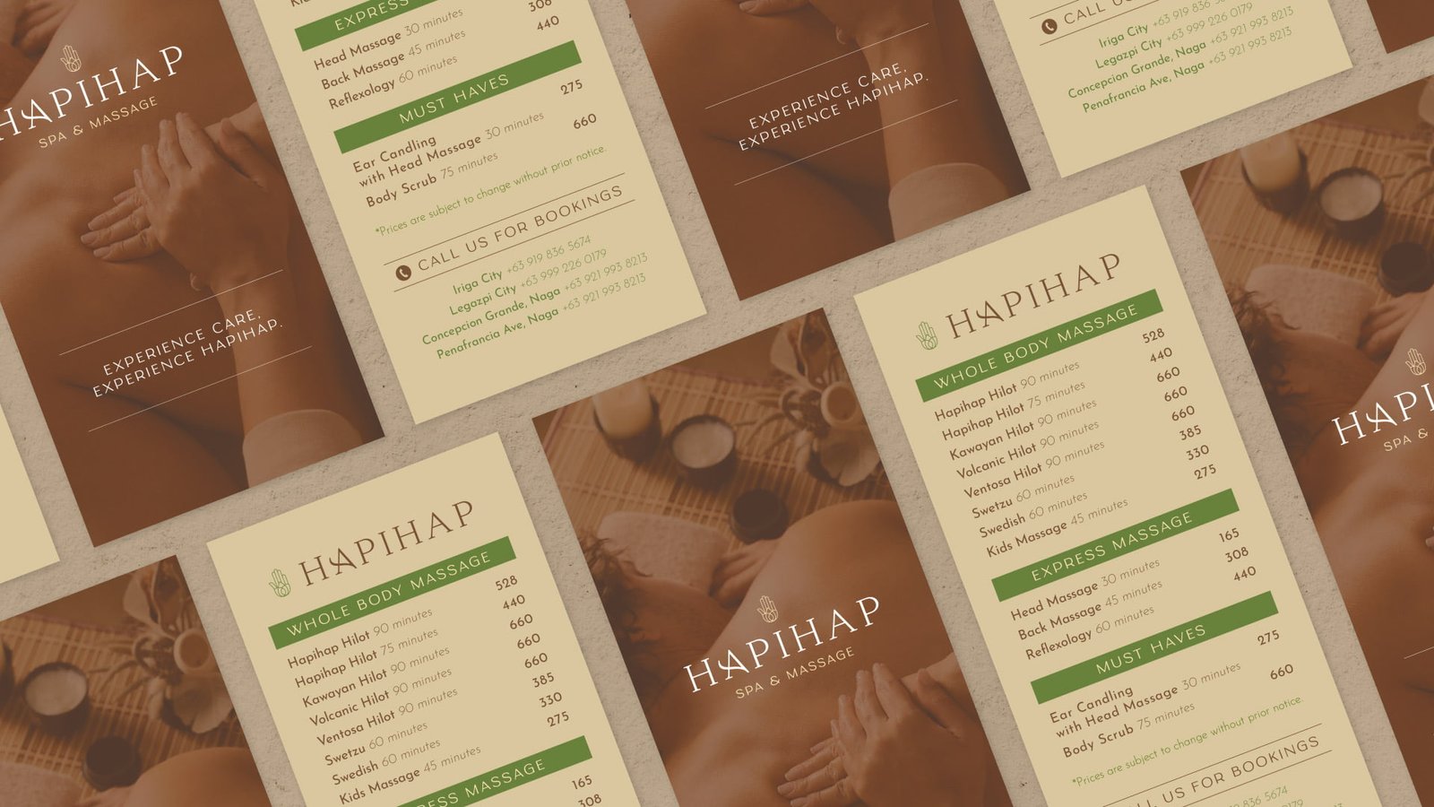
Hapihap does not only offer massage services. Here, you are cared for. You are home. You come out of their spa feeling healed from stress and body pain.
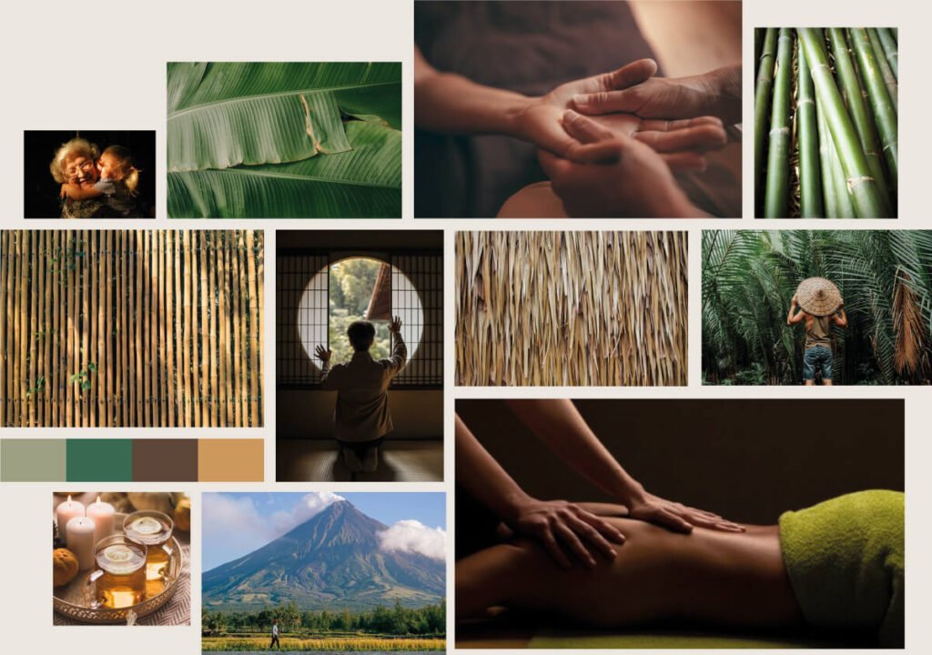
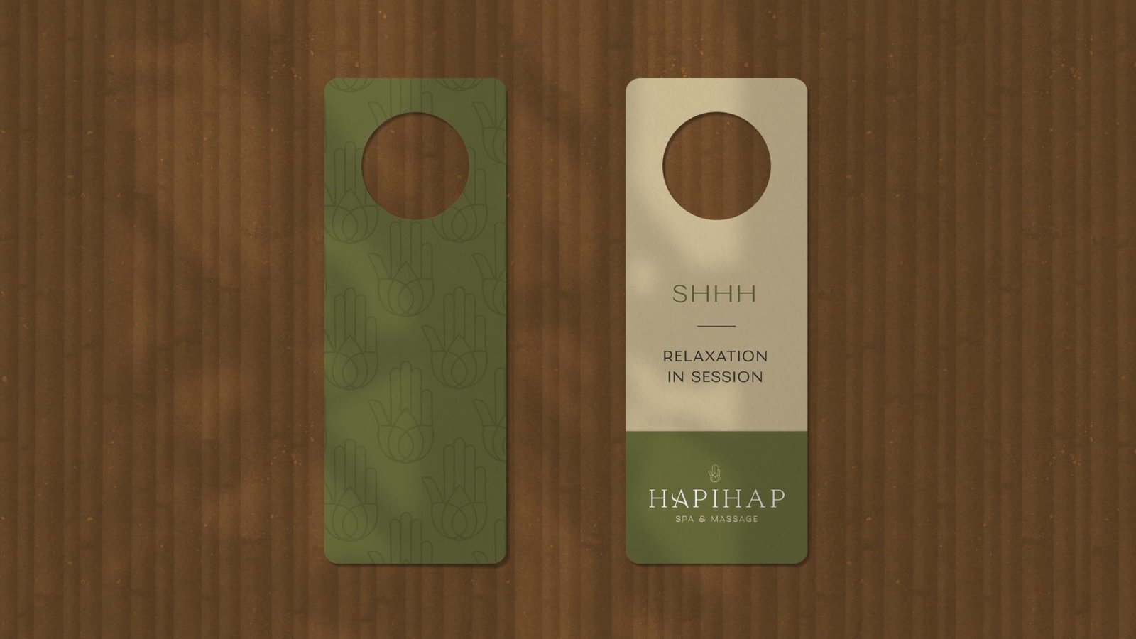
Hapihap’s visual aesthetics should look homey and relaxing yet a bit more elevated to give way to their new and higher price point. We wanted to also position the brand as a proudly Bicol brand that uses local Bicolano materials throughout their interiors.
Overall, Hapihap wants you to feel at home and cared for.
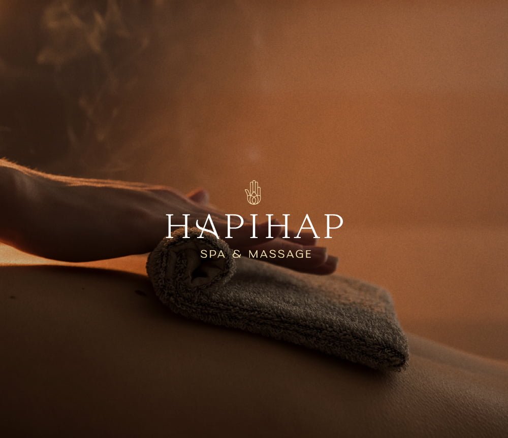
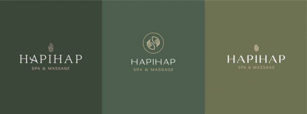
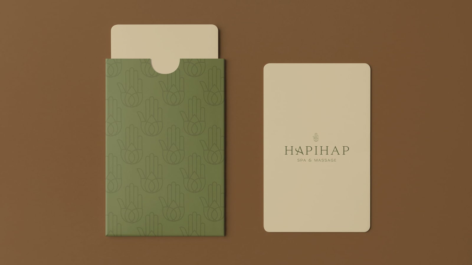
I gave them 3 logo solutions that all match the positioning we agreed on and they believe that the first one was the best option.
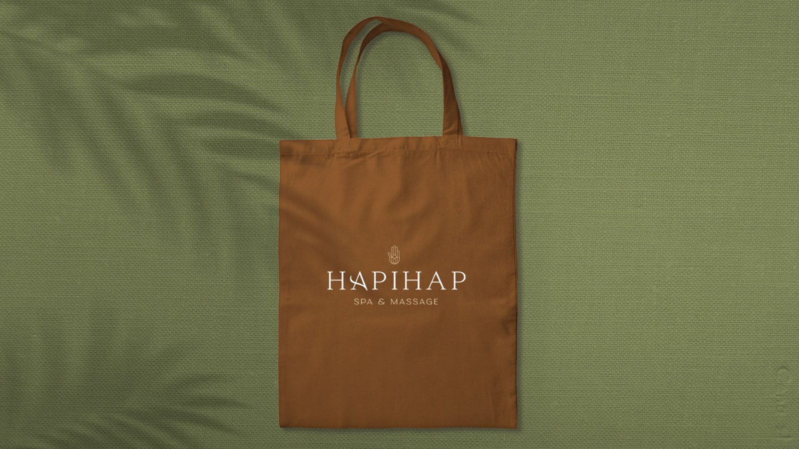
I still used a hand for their icon, representing the direct translation and meaning of Hapihap which is “caring touch”. At Hapihap, each of their clients come out recharged through the caring and professional hands of their therapists.
I also wanted to pay homage to the old logo so their previous clients will not lose their sense of familiarity with the brand.

“Before, branding is not important to us but now we love the overall new look of our brand.
– M. Mirabel, Owner, Hapihap Spa and Massage, Philippines
We’d love to know more details about your business! Let’s see if we’re a great fit.
| Cookie | Duration | Description |
|---|---|---|
| cookielawinfo-checkbox-analytics | 11 months | This cookie is set by GDPR Cookie Consent plugin. The cookie is used to store the user consent for the cookies in the category "Analytics". |
| cookielawinfo-checkbox-functional | 11 months | The cookie is set by GDPR cookie consent to record the user consent for the cookies in the category "Functional". |
| cookielawinfo-checkbox-necessary | 11 months | This cookie is set by GDPR Cookie Consent plugin. The cookies is used to store the user consent for the cookies in the category "Necessary". |
| cookielawinfo-checkbox-others | 11 months | This cookie is set by GDPR Cookie Consent plugin. The cookie is used to store the user consent for the cookies in the category "Other. |
| cookielawinfo-checkbox-performance | 11 months | This cookie is set by GDPR Cookie Consent plugin. The cookie is used to store the user consent for the cookies in the category "Performance". |
| viewed_cookie_policy | 11 months | The cookie is set by the GDPR Cookie Consent plugin and is used to store whether or not user has consented to the use of cookies. It does not store any personal data. |